Time series analysis of my email traffic
Published on 13th of February, 2021.
I’ve been using gmail since back 2006 – when it was still an invite-only beta. In these last 15 years I have received a lot of emails. I wondered if I’m actually receiving more emails now than back then, or if there are any interesting trends. I want to see if I can make a good model of my email traffic.
Fortunately obtaining a time series of your email traffic is very easy. You can download a .mbox file with all your emails. Such a file can easily be processed using the
Simple trend analysis
By looking at specific components of the time series we can discover some basic trends. In principle we can model trends as as a sum of trends on different timescales. For example the entire timeseries has components in the scales:
- Time of day
- Day of week
- Time of year
- Global (non-periodic) trends
We can look at these seperately, but a more accurate model would models these all at the same time. Gelman et al. describes how to do this using Bayesian statistics, and ti would be good to try adapting their methods, but for now we’ll just use a package instead.
Global trends
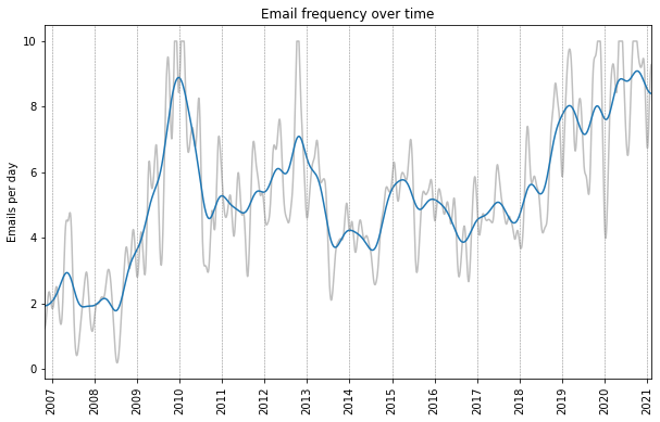
We can get a useful timeseries by counting the total number of emails received each days. Plotting this timeseries is however not very useful, because it is extremely noisy. To look at patterns in the data we need to smoothen it. This is done by applying some kind of low-pass filter, and there are many choices for a filter. Very popular is to use a rolling mean, but I personally prefer to use a Gaussian filter since the final result looks smoother. In the signal processing literature people would prefer using filters such as a Butterworth filter. At the end of the day, we’re mainly using the filters for the purpose of plotting so it isn’t too important.
Below is a plot of the email timeseries with a Gaussian filter with a standard deviation of 60 days (blue) and 15 days (gray). We can see that I receive about 4-8 emails per day on average. This does not include any spam, since these emails eventually get deleted and are therefore not in the email archive. We can see there are a significant spike in activity in 2010, and an increasing trend over the past couple years. We can also see a lot of local fluctuations, and as we shall see these can be largely attributed to a fairly regular seasonal variation.
Weekday trends
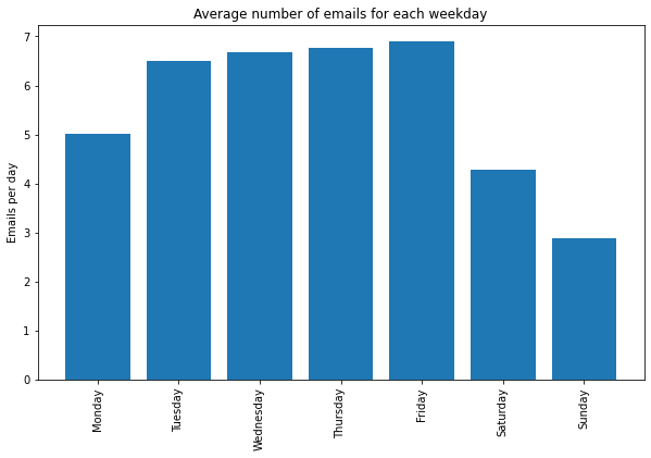
Unsurprisingly I receive less emails on the weekend. Interestingly emails are nearly equally common on Tuesday through Friday, but less on Mondays.
Seasonal patterns
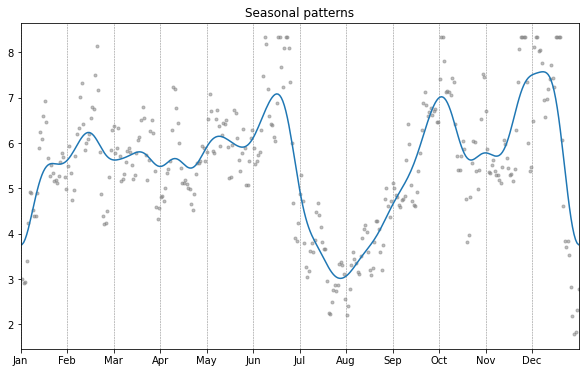
Below is a plot of seasonal trends, the blue line is smoothed with a standard deviation of 7 days, the gray dots with 1 day. We can see two dips, one around new year and one in summer, both times of vacation. There are also monthly oscillations, and a peak before and after summer, and before the winter holidays. I don’t have a satisfying explanation for this.
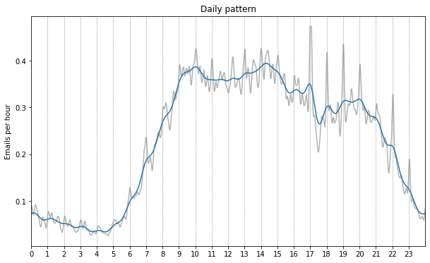
The daily trend shows some very clear patterns as well. Here the blue line is smoothened with a standard deviation of 15 minutes, and the gray line with 3 minutes, the times are all in UTC.
We can clearly see that most activity is concentrated between 9:00 and 15:00. We then see two decreases at around 15:00, and 17:00. The first probably corresponds to the end of the working day (during summertime in the Netherlands / Switzerland), the second drop may also correspond to the end of the working day but for emails whose timestamps lack timezone information. We then see reduced activity, which starts to taper off even further from about 21;00 onward. This may correspond in part to email sent during the American working day, and in part in the European evening. Then finally there is very low activity during the night between roughly 23:00 and 5:00.
On the gray curve we can also see a peak corresponding at each hour mark, which are probably all caused by emails scheduled to go out at a particular time.
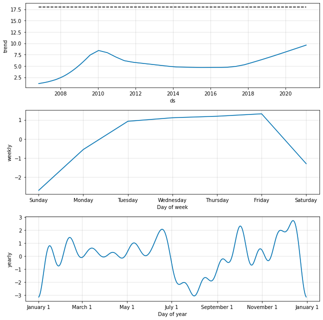
Additive model
Rather than looking at each timescale separately as we have done so far, we can model the different time scales at the same time in an additive model. In a simple model we will model our signal as
where the first term has a 7-day period, the second term a 365 (or 366) day period, and the third term is only allowed to change slowly (e.g. once every few months). Finally we assume a constant Gaussian noise term for the residuals of our model, which we don’t assume to be constant in magnitude, but always centered at 0. All of the components in our model can be taken to be a Gaussian process (even the magnitude of the noise). The details on Gaussian processes and how to fit them are perhaps nice for another blog post, but for the time being we will use a package to do all the work for us. We will be using Prophet, which is developed by Facebook. Its main use is predicting the future of time series, but it also works fine just for modeling time series.
The resulting model seems quite similar to what we have already discovered previously. The global trend in particular is a bit less oscillatory, but the weekly and seasonal trends are nearly identical.
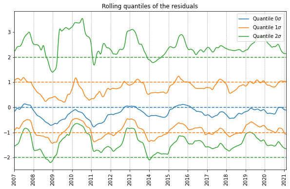
Analysis of the additive model
Next we can wonder how accurate this model is. The model assumes that the noise, and hence the residuals, are normally distributed. Let’s try to see how well this assumption holds up by analyzing the distribution of the residuals. In a normal distribution, a distance of 1 standard deviation to the mean corresponds to the quantiles of 0.159 and 0.841 respectively. And similarly a distance of 2 standard deviation from the origin corresponds to quantiles of 0.023 an 0.977 respectively. Finally, the median and mean should coincide. We can therefore compute these quantiles in a rolling fashion, and normalize by dividing by the standard deviation. If the residuals are normally distributed, these rolling normalized quantiles should stay close to horizontal integer lines.
Below we plotted just that, with a rolling window of 200 days. We can see that the rolling median, and the rolling quantiles corresponding to one standard deviation, both correspond well to a normal distribution. We do see a bit of deviation between 2009 and 2011, which is likely caused by the sudden spike around the start of 2010, which seems a bit of an outlier.
The 2-standard deviation rolling quantiles seem skewed towards bigger values, however. This is because there are many days with very large spikes in email traffic, and the global distribution of email traffic is not symmetric either. Furthermore we are dealing with strictly positive data (I can’t receive a negative number of emails), this in itself means that the residuals of any models are not going to be normally distributed. Therefore the model’s assumptions are invalid, and a more accurate model would make more accurate assumptions about the distribution of the residuals.
However, assuming normality of the residuals tends to make computations much more easy, and a model with a more accurate noise model might be difficult to fit, especially on large amounts of data. I might try to do this in a future blog post. We are dealing here with counting data (namely the number of emails in a given day). Such data is often modeled by a Poisson distribution rather than a normal distribution. The main assumption of a Poisson distribution is that the events of arriving emails are all independent. This is probably not the case, but we can either way see how well this assumption holds up.
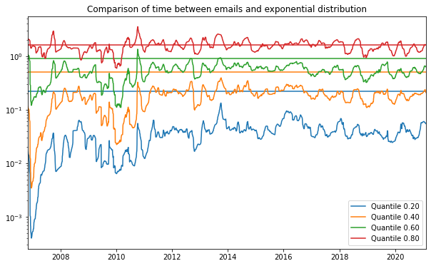
Distribution of time between consecutive emails
Finally let’s try to get a deeper understanding of time series by considering the distribution of time between consecutive emails. Having a good understanding of this can help to model the time series better. If we model the arrival times of all emails to be independent, except for a global variation in rate, we are naturally lead to model the time between consecutive emails by an exponential distribution:
where is a rate parameter that depends on time, since we already established that the rate at which we receive emails is not constant over time.
If we divide an exponential distribution by its mean, it will always me an exponential distribution with unit rate. We can use this to obtain a similar plot to the plot of the residuals. We will divide the time series of time between consecutive emails by a rolling mean, and then we will plot the rolling quantiles of the resulting data. These can then be compared to the quantiles of a standard exponential distribution.
This is done in the plot below, and we can clearly see that the distribution of time between consecutive emails is not exponentially distributed. The distribution is much more concentrated in low values than expected from an exponential distribution. It also seems to have a bit longer tail than predicted by an exponential distribution (although this is harder to see in this plot). This is because emails are not independent. For instance, if you’re having an active conversation with someone you might get a lot of emails in a short amount of time, but most of the time emails come in at a slower rate. Furthermore there are quite a number of times that emails arrive at the exact same second, which should have very low probability under an exponential model.
One can try fitting different distributions to this data. For example a gamma distribution has a better fit, but still does not properly model the probabilities of very small time intervals. Perhaps a mixture of several gamma distributions would fit the distribution of the data well, but this kind of distribution is hard to interpret. A good statistical model should have a good theoretical justification as well.
Conclusion
We conclude the analysis of this email time series for now. I can’t say that I have learned anything useful about my own email traffic, but the analysis itself was very interesting to me. It can be interesting to dive into data like this and really try to understand what’s going on. To not only model the data (which could be useful for predictions), but to also dive deeper into the shortcomings of the model. I will hopefully get back to this time series and come up with a more accurate model that makes more realistic assumptions about the data. The only way to come up with such models is to first understand the data itself better.
Other posts you may like
Rik Voorhaar © 2025